Not every project needs an architectural intervention. Sometimes the bones of a property are exactly right and the work to do is introducing fitted furniture, rethinking the kitchen and choosing new colours, fabrics and lighting to transform your home. Although there’s no demolition and construction, this type of project can be challenging in a different way, because there’s no builder telling you what has to happen next, only a growing pile of decisions and the nagging sense they all have to be made together.
Kate Guinness has spent years making those decisions for other people. Her projects have a rare quality: from day one they look like they have been lovingly curated over decades. We wanted to know how that’s actually done and what it teaches anyone refurbishing a home of their own, whether period, modernist or somewhere in between.
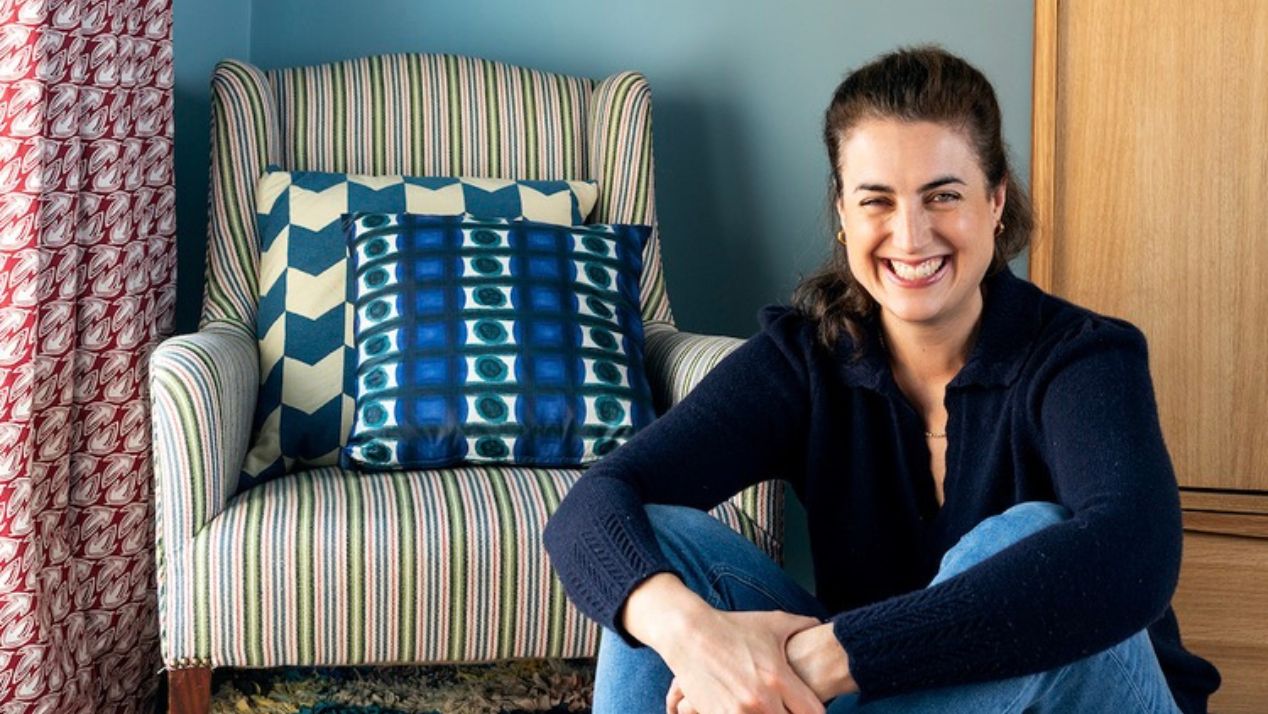
(Portrait by Robert de Segundo)
Almost never with favourite things! Floor plans first, always: furniture layouts, how the kitchen and bathrooms work, how you move between spaces, what each room is really for. The colour palettes and the detailed design come afterwards. We might do a loose mood board early on, just to gather a feeling, but the nitty-gritty of decoration definitely comes second to getting the plan right.
If the layout is wrong, no amount of lovely fabric will save the room. And once the plan is settled, every decision after it has somewhere to belong.
We deliberately don’t ask people to decide everything at once. Some clients want to see the whole picture before they’ll agree to anything, and that’s fine…but most people get overwhelmed if you ask them to choose a lampshade at the same time as a floor. So we stagger it.
Some things simply have to come first because the build needs them: the fitted elements, the hard finishes, the fixed lighting, the kitchen and the sanitaryware. Those get decided early. Then we layer the rest in: the main fabrics for a room together, say the curtains and the sofa, but perhaps not the little side chair in the corner, which we’ll come back to. You might have a favourite rug in mind, but I’m afraid that often comes last!
The lovely thing about doing it that way is that it produces the layered look almost by accident, because you are literally layering the decisions.
Enormously. If you choose a rug at the very start, you tend to play it safe. Something neutral, because you don’t yet know what's going on around it. Choose it at the end, once everything else is settled, and you’ll often go for something far bolder, because now you can see exactly what the room needs to pull it together.
That’s the real argument for staggering things. It isn’t just about being less overwhelmed (although it helps with that). It’s that decisions made in sequence tend to be braver and more precise than decisions made in the abstract, at the beginning.
This also leaves room for fortuitous finds. Sometimes I find the most amazing antique, for example, which slots in wonderfully at the last minute, even though I might not have considered it for the scheme had I come across it earlier in the process.
That’s the trap. It's one of the most common things we talk clients down from: a piece they've been in love with for years that simply doesn't work in the room they're now designing.
The way through it is usually to show, not tell. We’ll put the pieces together on a page so you can see for yourself that they’re fighting each other, and then show you the same page with one thing swapped out, and how much better it suddenly looks. People tend to see it immediately. Often it isn’t even about taste; it’s about scale. The light you love is the wrong size, and this very similar one sits properly in the space. You rarely have to give up the idea you were attached to. You just have to hold it a little more loosely.
Very much. People arrive with rules they’ve made for themselves. “I’d never have yellow,” that sort of thing. And by the end of the project there’s a yellow cloakroom they adore! We aim to make slightly bolder choices than most people feel able to make on their own, and to give them the confidence to mix things.
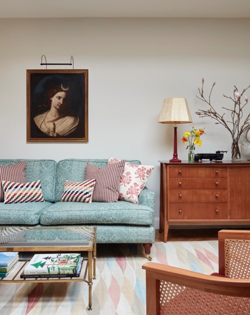
A lot of the fear comes from looking at everything at once. If you try to judge the whole scheme in a single glance, of course it feels like too much. That patterned fabric on the sofa and a pattern on the curtains, surely that’s mad. But taken as a sequence of considered decisions, it isn’t mad at all. It’s confident. Half of what we do is simply holding someone’s nerve for them.
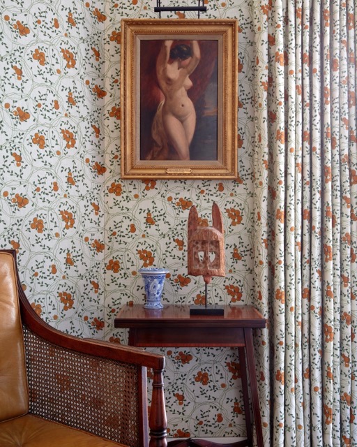
A mixture, and the real-world ones are more important than people expect. There are wonderful digital tools now, and for furniture and lighting we’ll often put together two or three schemes for a room on screen: here's a sofa and chairs and the shape of it, here’s another idea with a different sofa. That part works well digitally.
But renders leave me a little cold. They don’t give you texture, or the character of things, and because we use so many antique and vintage pieces alongside new ones, a computer image just can’t tell the truth about a room. So in person we bring the actual materials — fabric samples, paint, wood for the floor, tiles — bags and bags of it, so people can look and feel and see it in reality. With paint especially, we daub big patches onto a board and hold it against different walls, because the same colour can look like two different colours depending on where the light hits it. You have to see it in the room it’s going to live in.
Be organised and be practical, more than anything. The single most useful thing you can do is build a programme-of-works at the very start — before day one — and find out which week you’ll need what. Which week the sanitaryware, which week the paint schedule, which week the tiles. Builders often assume you know the order things are needed in, and you don’t, so ask. Then make your decisions in that order. Don’t get bogged down choosing a curtain trim when your sanitaryware is urgently needed on site as it will rush that important decision.
Have an end goal in mind, but hold it loosely. Everyone starts with a Pinterest image they’ve fallen for, and that’s fine as a point of departure, but don’t become its hostage! If the project is naturally moving in a different direction, let it. I once had a client obsessed with recreating a bathroom of green tiles from one image, and every tile company told us those tiles weren’t even suitable for a bathroom; they’d just been styled purely for the photograph. A lot of Pinterest is styled for the picture, not for living. It’s a brilliant tool, as long as it doesn’t start giving you the orders.
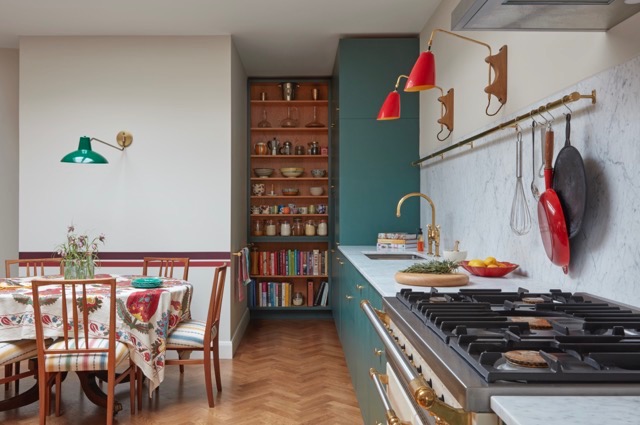
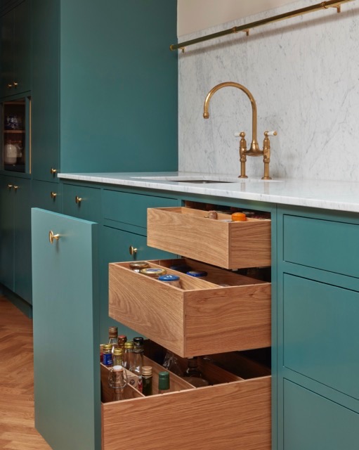
We wanted a kitchen that was incredibly high quality, making use of the best modern drawer runners, hinges and fixings, but could achieve a timeless look. We know you’re renowned for the exposed plywood edge, but one of your other styles, called Frame, looked more adaptable. Depending on the handles, the colour, the worktop and everything around it, it could read as a contemporary shaker style kitchen.
And what actually sold my client wasn’t the look at all. He’s a barrister, the sort of person that loves knowing exactly how something works, and what won him over was opening the drawers. The engineering underneath is extraordinary. Most kitchens disappoint you the moment you open them with a beautiful front giving way to a shoddy chipboard interior. This one does the opposite. It gets better and better the deeper you go.
In a way, the layering tells you. You’re adding things in sequence, and you reach a point where the room is doing everything it needs to, and anything more is just noise. We deliberately hold the very last layer back to the end of the project.
That last layer is the soft, finishing five per cent: cushions, a few lampshades, sometimes an antique rug. We leave it deliberately, because those are the things you genuinely can’t judge in the abstract. They’re responding to everything else already in the room, so they have to be chosen against it, not ahead of it. And by that stage clients have usually maxed out anyway. They’ve made a hundred decisions and can’t picture a lampshade on a page any more.
We arrive with cushions and shades and rugs, style the room for real once they’ve moved in, and let them see it in the flesh rather than choose it more abstractly.
So knowing when to stop is when it feels resolved in the room, not when the spec list is ticked off. Though I’d gently push back on the word “finished.” I try hard not to be precious about it, because the day we leave isn’t the end of the room; it’s really the start of it.
I went back to a project recently and it was almost exactly as we’d left it, but the owner had hung more of their own art and their things had crept in, and it felt wonderfully lived in. Others change completely: a new baby, a dog, a desk in the corner because someone now works from home. That’s exactly right. It’s their home, not a museum. The best result isn’t a room that stays frozen the way I designed it; it’s one that lives and breathes.
For our collaboration with Kate Guinness, view our Islington apartment case study. You can see the Frame style and explore the options on our Bespoke page.
And if you’re embarking ona bigger renovation, architects Archmongers spoke to us about how to start.
Keep reading our design guides, product advice and stories from our Uncommon friends.
View all